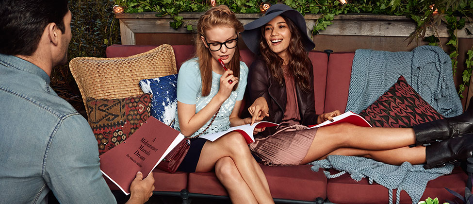
Pantone announced it’s color of the year yesterday and the response was…underwhelming. Plenty of people made obligatory jokes about it being the “neutral of the year” and reminiscent of a bad 80s prom dress. A few expressed their confusion at naming the color after a popular chicken dish.
Pantone says, “Much like the fortified wine that gives Marsala its name, this tasteful hue embodies the satisfying richness of a fulfilling meal while its grounding red-brown roots emanate a sophisticated, natural earthiness.”
I, personally, love it. It’s definitely a departure from the aqua, lavender and emerald green colors of Pantone past, but I think it will make for some awesome home decorating options. Check out some inspirational links below and you’ll see amazing couches, rugs, pillows, and more. You can even paint a wall if you’re really committed to Pantone’s Color of the Year selection.
What are your feelings about marsala?
Image from Pantone’s website


