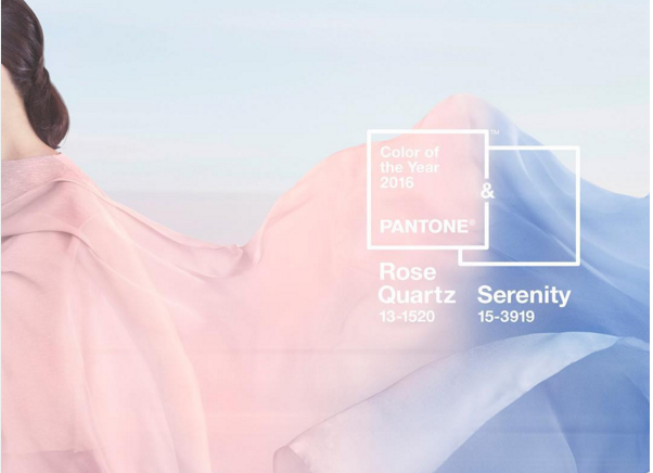
Pantone went really crazy this year and released not one, but TWO colors of the year for 2016. The pastel-rose hue and periwinkle blue that were crowned as color royalty for the next year have predictably drawn both praise and criticism from the internet.
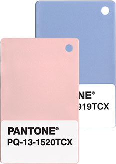
via Pantone
I get it, they seem like weird choices in the depths of winter when it’s all about bold dark colors, but try to remember that there will come a time when the sun is shining, birds are chirping, and these colors can totally work for a room.
We rounded up a collection of inspiration pics that skew more towards serene grown-up spaces instead of baby nursery. Enjoy!
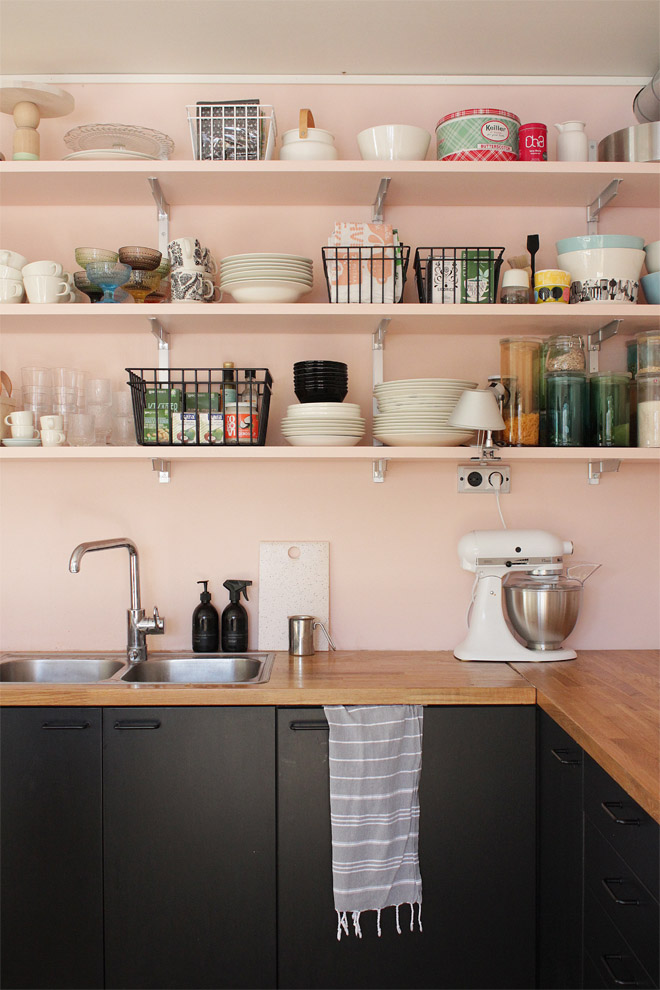
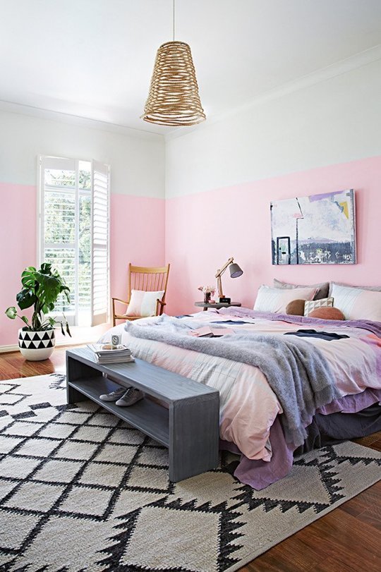
via divaaniblog
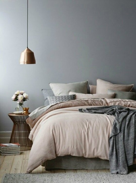
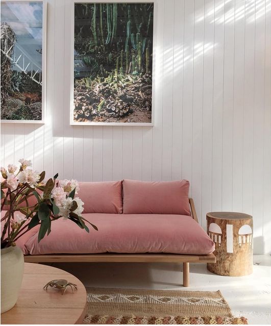
via Pop and Scott
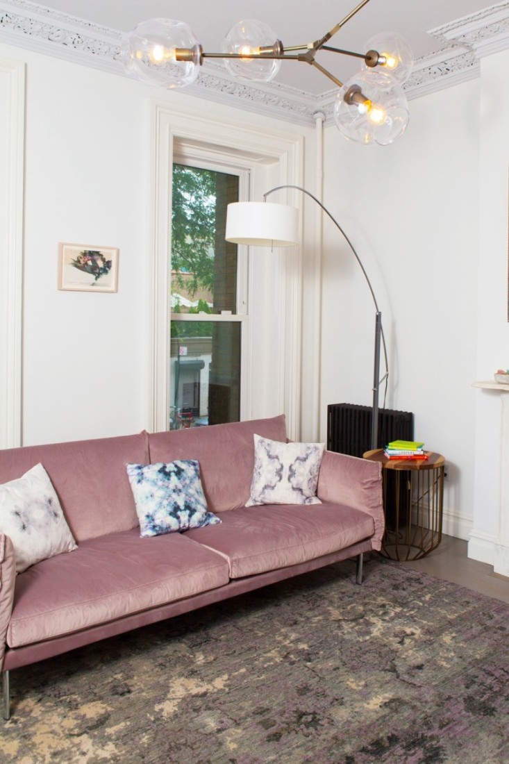
via Refinery29
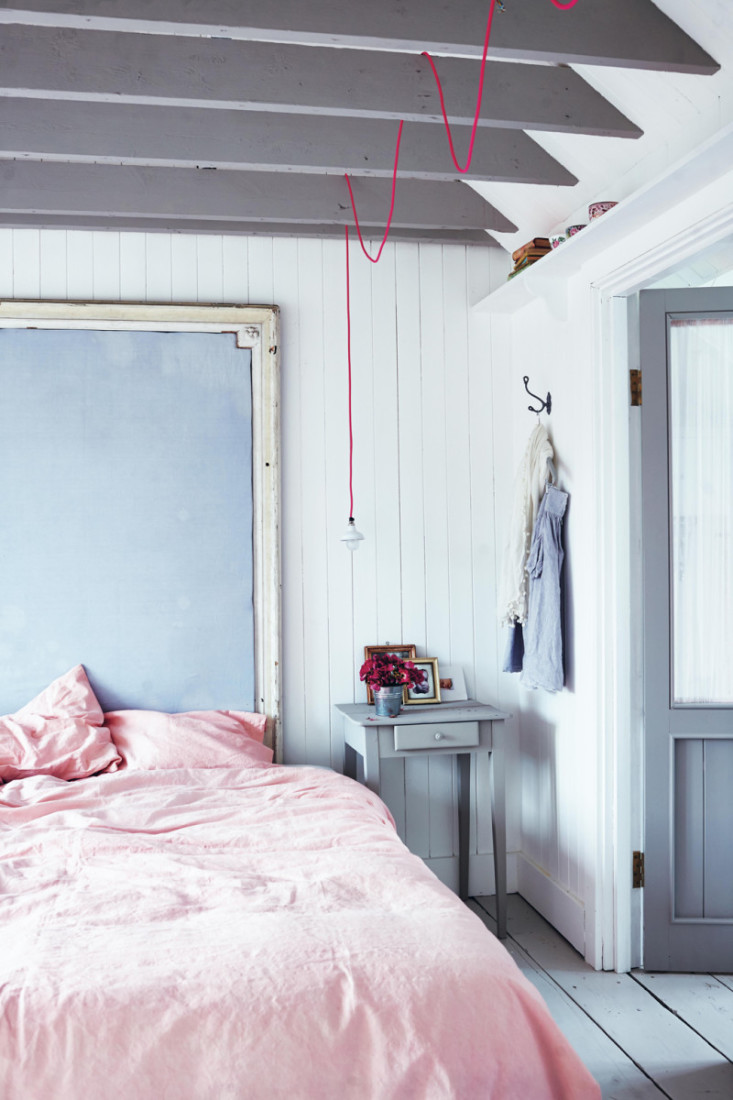
via Decor8
What do you think about the colors? Could you see yourself using them in a room?